Poster Preparation
& Presentation
Updated 4/27/2015, JC
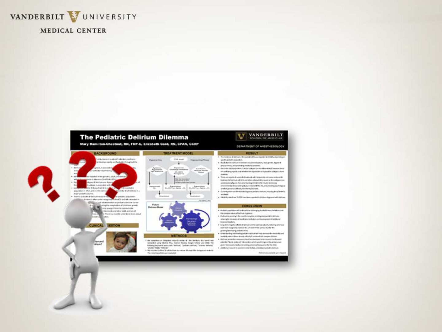
What Makes a Great Poster?
Meets TWO goals:
1) Attracts attention so passersby STOP for a second look
2) Concisely communicates the research/case
Concise:
A poster is not a journal article. A viewer should get your message in
3-5 minutes and be able to read every word in no more than 10 minutes.
Good rule of thumb: word count of ALL text should be about 1,000 words.
Communicates Visually:
Even if the poster only consists of text, it needs to be uncluttered and
evenly spaced. Graphics should be CRISP, not distracting and clearly
supportive of conclusions. Don’t include “throw-away” graphics just to
have visuals.
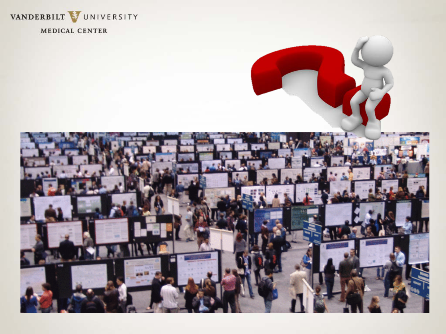
Make Sure Your
Poster Isn’t Lost
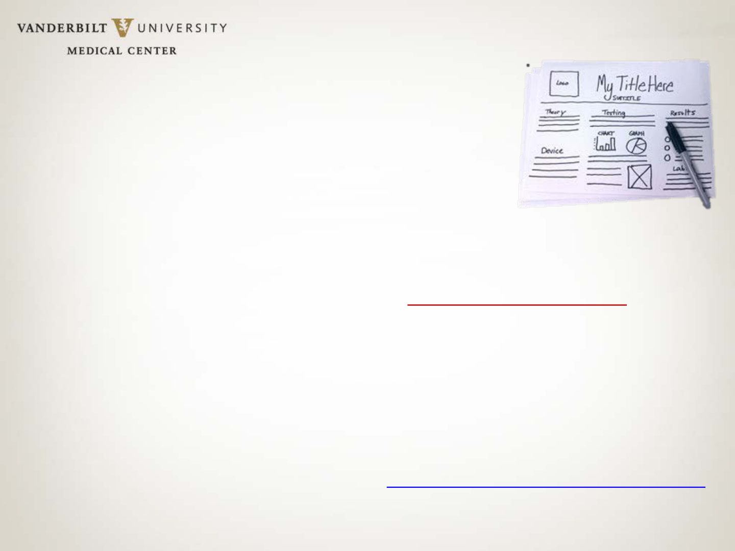
Plan Your Poster
• PLEASE read & follow ALL meeting instructions regarding
poster production, size and presentation.
• If this is your FIRST poster, plan on at least a week’s time for just
the design. Reserve enough time for printing, if your poster
needs to be printed.
• Sketch it out. Large index cards are great planning tools.
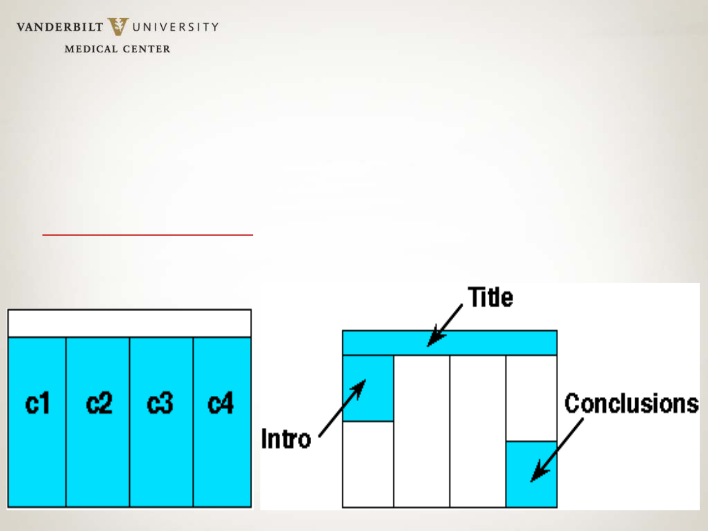
• Arrange contents in organized columns, grouped by SHORT
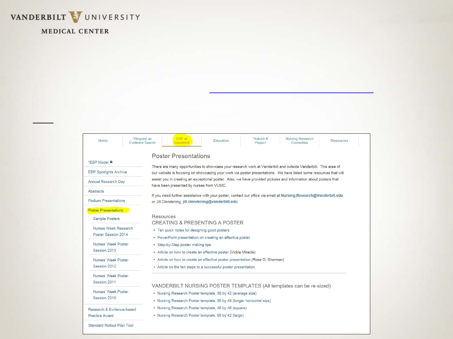
headers. (Templates provided at www.VanderbiltNursingEBP.com
already have headers, but you can modify them, if needed.)
Design Tips
• Don’t overuse color. It distracts from data. Colored backgrounds can increase
print cost.
If used, muted shades, not bright, are best for backgrounds.
• A single, emphasis color is best, particularly for headers.
Ideal design: Never use more than three colors.
• Most poster sessions are in halls with florescent lights, which distort colors.
Bright colors are altered MOST by florescent lighting, so keep this in mind.
• Graphics should be well-labeled, but with minimal text, and should be easily
visible from six feet away
. Test this out when you print your poster!
• Space evenly between different elements on your poster for a CLEAN and
EASY-TO-READ design.
Design Tips
• Double-space text, using left justification. It is easier to read. Do NOT double
space after each sentence. Your computer automatically adjusts spacing for you!
• San serif fonts (no shelves/curls on letters) are easier to read, but there are a
few serif fonts that are fine. Try Helvetica, Arial, Geneva, Times Roman,
Palatino or Century Schoolbook. Do NOT use a specialty font.
• Use one font throughout the poster. Create emphasis by using bold,
underlining or limited
color. Avoid italic text; it is harder to read.
• Body text should be readable from several feet away. Section headers should
be no smaller than
32 point, Bold. Supporting text should be no smaller than
24 point.
• Narrative, if necessary, should be BRIEF and no smaller than 20 point. If you
need more narrative support, provide handouts
.
Design Tips: Poster Flow
Flow of information on a poster is from left to right. Don’t jump
around! If, as you are practicing the presentation of poster, you
find yourself moving through the content in a non-linear fashion,
re-design your poster!
Design Tips: Poster Title
The poster TITLE should be readable from 20 feet away!
Letters should be about 1 inch high. Different fonts will be take up different
space, but try these minimum sizes for your title content:
72 ptBOLD for title; 54ptBOLD for authors’ names;
36 pt BOLD for poster headers
Include in the title of the poster:
– Title of the work – Try to shorten this as much as possible!
– Author(s) names (Include first and last names and degrees. Separate
each individual’s information from the next individual with a semicolon.)
– Institutional affiliations (city or state can be dropped for space
considerations)
– Poster number (if provided/required)
Design Tips: More to Remember
• Don’t add bullets or colons to section headers. Looks too busy.
• Avoid long blocks of text! –10 sentences, maximum for a bullet. Less is better!
• When using acronyms and numbers in body text, a trick is to reduce the font
size of only
that text. This keeps acronyms/numbers from overpowering the
rest of the text.
• Create the entire poster in one environment (Mac or PC). Switching between
can cause lost images, botched graphs, etc.
• Don’t display two-dimensional data in 3-D. Three-dimensional graphs obscure
the true difference between bar heights and are usually messy.
• When you include a photo, add a thin border to the photo to avoid a
“floating” effect.

Getting Started
• Download and open a template. There are several sizes available & you can
ALWAYS
resize a template.
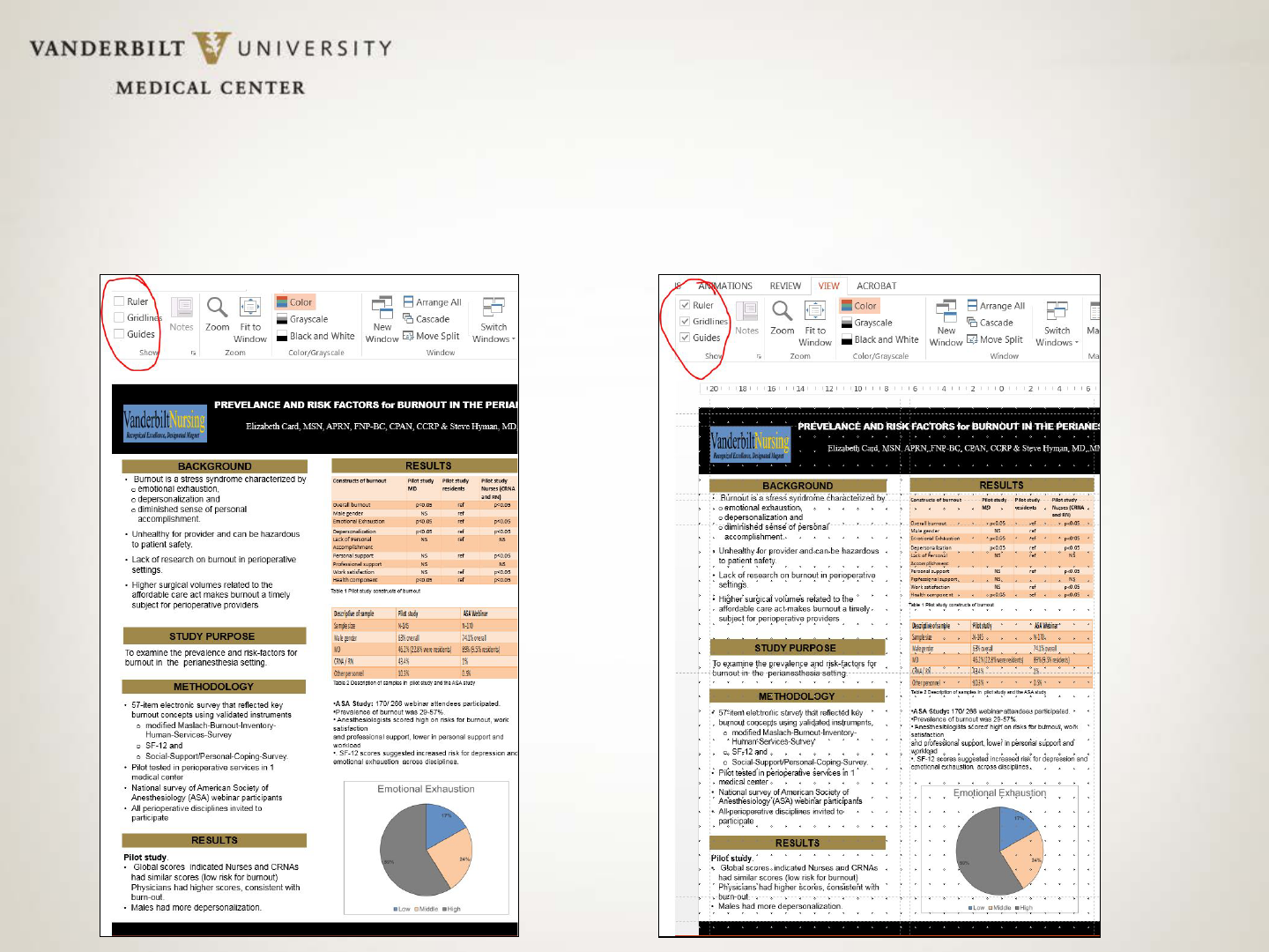
• When you have the template open in PowerPoint, click on View tab. Turn on
Gridlines, Guides and Ruler. These will NOT print but will help you easily align
figures, text boxes, etc.
• Text boxes are already set up on the poster templates, but you can create new
sections (You can copy & paste the section headers and then re-name the
header.) Add text boxes and resize the text boxes as needed. (Click Insert >>
Text Box)
Getting Started
Slides with Ruler/Gridlines/Guides turned OFF & turned ON
Getting Started
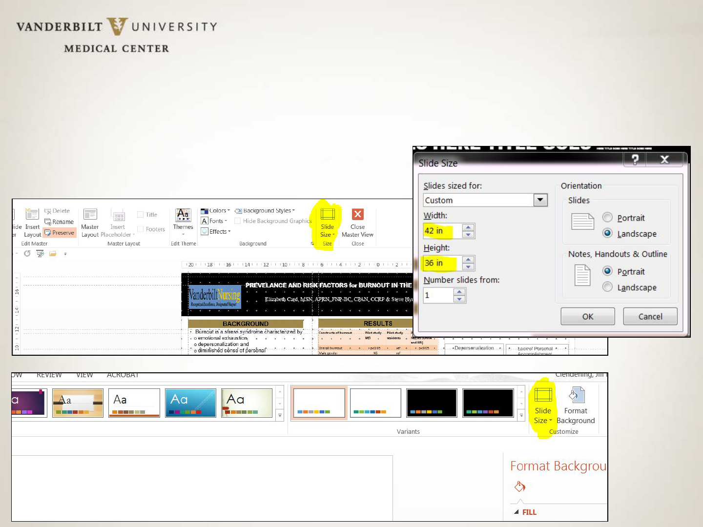
Changing Slide Size
Why Use a Template?!
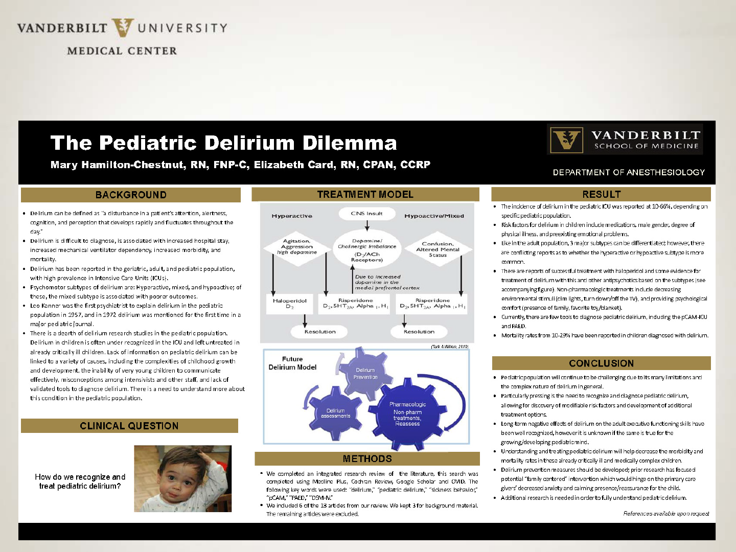
SAMPLE POSTER TEMPLATE: TITLE GOES HERE
All authors go here, with full names and degree/professional designations
BACKGROUND
RESULTS
TABLES/FIGURES
METHODS
CONCLUSIONS
• Body text goes here
REFERENCES
• Body text goes here
• Body text goes here
• Body text goes here
• Body text goes here

PowerPoint Pointers
• Maintain a 1 to 1.5" border of white space (empty space with no text) on
all
sides to accommodate printing variations & screen sizes (for E-posters).
You don’t want any of your hard work chopped off!
• Use ONLY standard fonts; specialty fonts may not print correctly.
• Type all special characters (e.g. Greek/mathematical symbols) directly in
PowerPoint rather than copying and pasting from another document.
Special characters pasted into PowerPoint can print incorrectly even
though the character displays correctly on the monitor. Insert special
characters by clicking Insert >> Symbol >> [character].
• Remember: All content should be readable from six feet away!

PowerPoint Pointers
• Make sure text boxes are completely on the page (slide). Even if text appears on the
page, the text box (shown by a ghosted , dotted outline) may extend beyond the slide’s
edge and can cause text to shift when the poster is printed or converted to a PDF.
• Insert figures and graphs using the “Insert” function, NOT by copying and
pasting the image or figure into the document. Click Insert >> Picture >> From
file >> [filename].
• It is better to use a graphics program, not PowerPoint, to resize your images to
the size you want them to appear on the poster.
• Images will look small when you view the entire poster at once. To get an idea
of how the picture actually looks, view your poster at 100%. (Click on VIEW
and then ZOOM. If it’s blurry on the monitor, it will be blurry when it
prints. Find a higher resolution image. Call the source of the original image,
such as a vendor. They are typically happy to supply images when you
explain the purpose.

PowerPoint Pointers: Photos
The biggest trouble most beginning poster designers get into is
having poor quality images on their posters.
• A good resolution for printed images is 300 dots per inch (DPI), but also
make sure the photo is a nice, large size to begin with.
• If you take a 2" X 2" image at 300 DPI and resize it to 4" X 4", you have
halved the resolution to 150 DPI. It will be BLURRY!
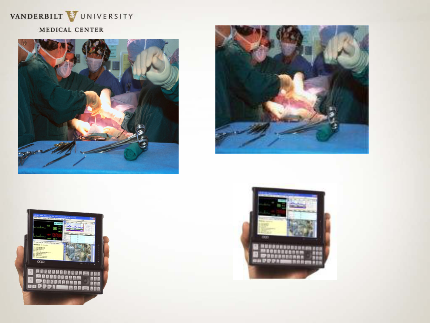
4 by 6 image at 300 dpi
(32 KB size file.) This is GOOD!
The SAME photo, pulled from a web
site: approx 96 dpi. This is BAD!
2 by 2 image, but at
300 dpi (17 KB size
file) This is GOOD!!
The SAME photo, pulled from a web
site: approx 96 dpi. This is BAD!
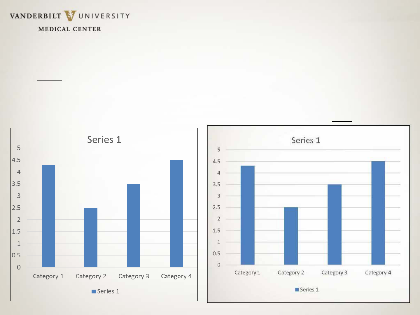
PowerPoint Pointers: Figures
It is best to create your charts and graphs in PowerPoint rather than scan
a chart or graph from another document and then paste it into a poster.
Chart created in PowerPoint.
Very crisp, nice resolution
Created in another program, converted to an
image & pasted into poster. Poor
resolution.
Hang ON!!!
(Or, remember your hanglines…)
Printing Resource at VU
Biomedical Research Education & Training Poster Printing, 307 Light Hall
Note: If you use this service, please contact Karen in advance to arrange
payment. They do not accept 1180s.
Contact: Karen Perry
Email:
bret.poster@vanderbilt.edu
Phone: 322-3835
Website:
http://bret.mc.vanderbilt.edu/bret/php_files/poster2.php
Hours: Typically 8:30 am – 4:30 pm (Always a good idea to call!)
• PC and Mac formats supported.
• Posters can be submitted on CD, jump drive or emailed to
bret.poster@vanderbilt.edu.
• If BRET must modify poster, cost is $30/half hour for design time, in
addition to print charge.
• Posters must be submitted at least two business days in advance of
when needed. Allow additional time before large conferences.
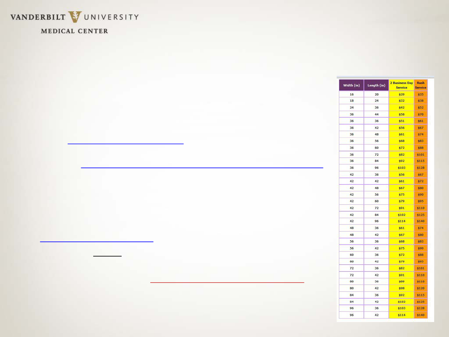
• Priced by size. (See table at right.) $10 surcharge for colored background.
Another Printing Resource at VU
Vanderbilt Printing Services
• On-campus location
268 Rand Hall
Email:
Campuscopy@vanderbilt.edu
Phone: 322-6849
• (Free pick up and delivery.)
• PDF format is preferred.
• Please specify the finished size
• Payment: 1180s accepted. Account and
center number can also be included in the
submission email.
Off-campus Poster Printers
If on-campus resources are overwhelmed, here are two off-campus options:
1) ProGraphics (Very close to VU)
ProGraphics Blueprint Company, Inc.
1811 Church Street, Nashville, TN 37203
ph: 615.327.0386 fax: 615.327.0389
• Approx. $60 on semi-gloss paper; same day or next-day turnaround
Caveat:
YOU MUST PICK POSTERS UP.
2) Midtown Printing http://www.shortrunposters.com/posters.html
• Only 18 x 24 ($2.97 each) and 24 x 36 size posters ($15.97 each).
• Standard production time is five business days, with express options available. Can
ship via UPS.
Submitting an Eposter
• If your poster is part of an Eposter (Electronic
poster) session, you should have received
instructions on how to create an Eposter.
• Read the instructions first. Ideally, do NOT
download any free poster program they offer,
such as PosterGenius. You can use PowerPoint &
then convert your poster to a PDF.
• Make sure all content is on ONE page. If you
have text boxes that fall outside the slide
boundary (check for ghosted borders), your
computer might “think” you have multiple
pages. This will mess up the PDF when you print.
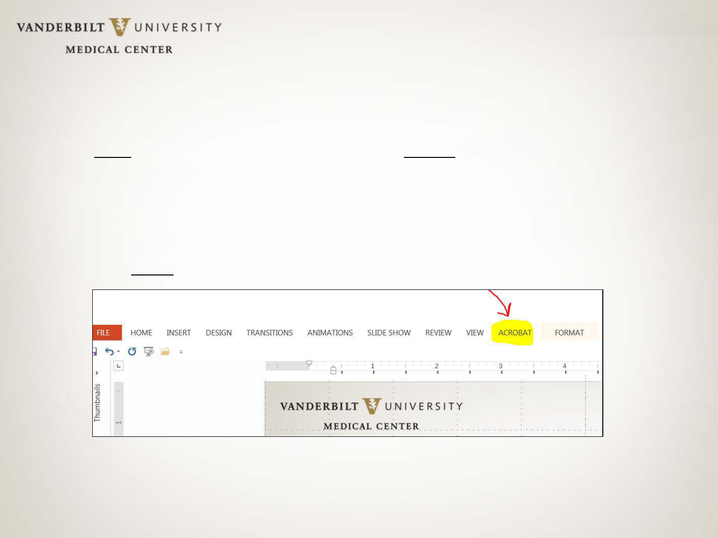
Easy PDF conversion
• You must have Adobe Acrobat (not just Adobe Reader) on your computer to be able
to convert your PowerPoint poster to PDF.
• If you have Adobe Acrobat already loaded on your computer, the BEST way to
convert your poster to a PDF is to select the Acrobat tab found in top menu bar
while you’re still in the PowerPoint program (See below). If you convert any other
way, you might have to resize the PDF output.
• Select the Acrobat tab. Click: Create PDF. A PDF will be generated. Save the PDF to
your Desktop.
Final Words on Design
• Don’t procrastinate. Your first poster may take a week or more just to
compile the content! It make take another week to complete the design.
Add on the time needed for the printer to print your poster, and you
could be looking at nearly 3 weeks!
• Type all content in a Word document, proof read, then have a friend
proof read it as well!
If you’re printing your poster, the cost increases if
changes continue to be made after a poster is printed.
• Sketch out a layout.
• If all else fails, and you just can’t get the layout to work, get a second
opinion from a colleague or call in resident experts for design assistance.
• Get a strong tube to protect your work! Weather, airlines, etc., will
destroy your work.
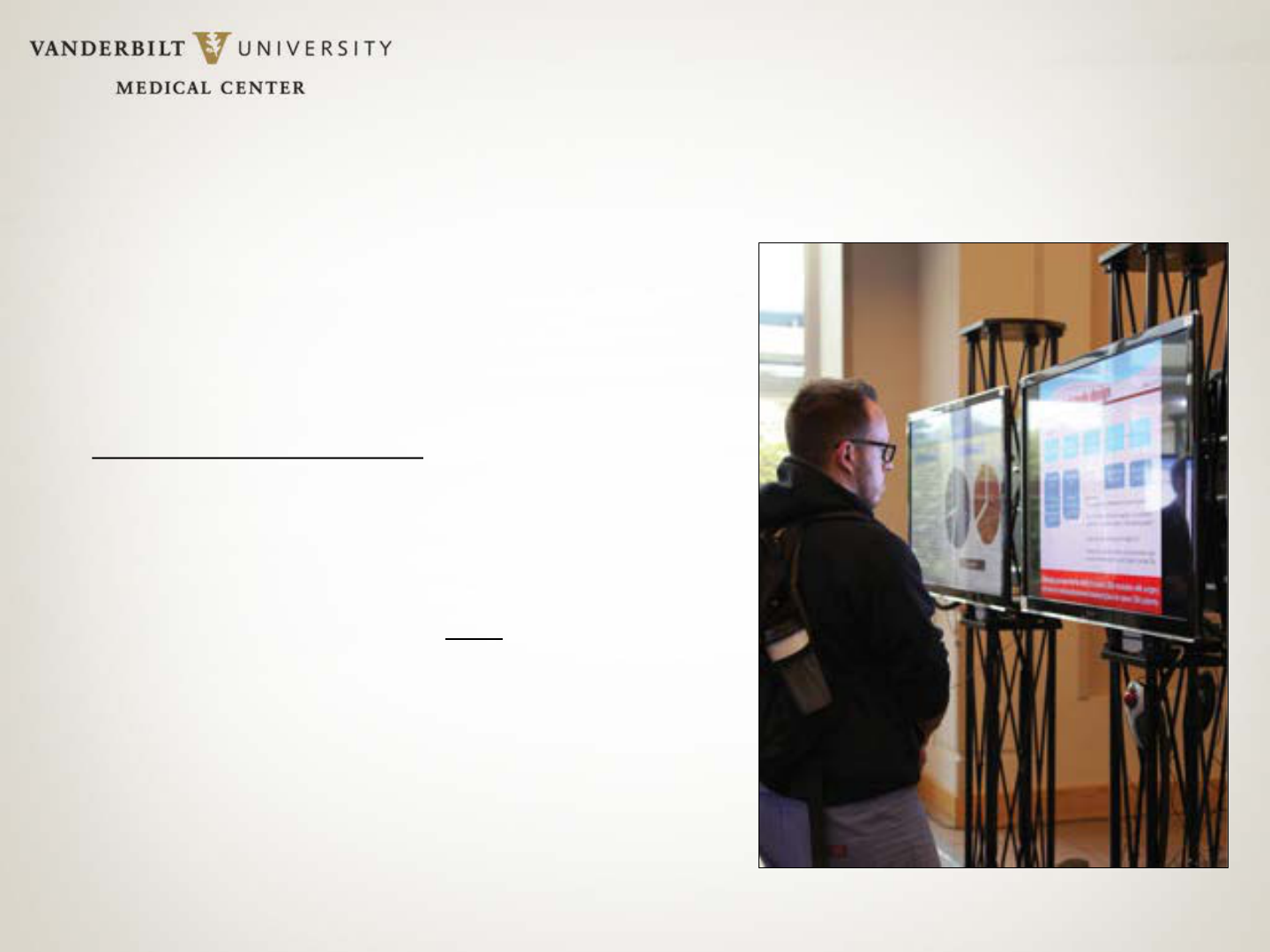
Tips on Presenting Your Poster
• Practice! If you are expected to give a timed presentation, use a stop
watch. Recruit family and friends who love you (a lot) to be your audience!
• Make eye contact, actively greet individuals, TALK to them!
Conversations are ENCOURAGED
.
• Find a way to explain your research/case study in 4-5 sentences. Make sure
you cover:
o What it’s all about.
o Why it REALLY matters.
o How you did what you did.
o What are the results.
o What is the final/take-away message.

Tips on Presenting Your Poster
• E-NUN-CI-ATE!
• Don’t talk too fast or mumble. Most of your listeners are likely meeting
you for the first time. And, while YOU are VERY familiar with your
research, for them, it’s new.
• Great collaborations and outstanding research have resulted through
networking at poster sessions. Make it easy for attendees to contact you
after a meeting is over. Have business cards handy or give them a copy
of a relevant paper with your email address on it.
• View your poster presentation as a chance to network, get feedback
from your peers, and to learn & it WILL become FUN.

… And Last, But Not Least….
If you’re stumped & need a little help, contact ME.
Jill Clendening
Program Coordinator, Nursing Research
Vanderbilt University Medical Center
1161 21
st
Avenue South
Medical Center North, Room S-2413
Nashville, Tennessee 37232-2424
Phone: 615-343-2992
Jill.clendening@vanderbilt.edu
Good Luck & Happy Postering!
